Responsive Web
When it comes to styling a web page or a mobile app or even being able to print out a web page, there are many tools that you can use. The main idea here is the CSS or a cascading style sheet. This special document usually holds all of the styling and formatting for the web page or mobile app you are designing. This could include anything that applies to the presentation of the content on the page; layout, colors, and even fonts. With a CSS file, it is easier to change the presentation of the content and allows the programmer to quickly change multiple aspects of the web page or app at once.
History of topic / library of code
There was not always CSS and the ability to change the styling and other aspects of the web browser. In the early days of web browsing, when Mosaic and and other early stage web clients were out, the only things you could change were the color and style of the font you see. Eventually, people complained about wanting custom touches and that they wanted more from their browsing clients. That is when a few people teamed up and made CSS. The first CSS idea was brought to attention by Bert Bos and Håkon Wium Lie. [CSSHistory]
Responsive Web Design
We know that CSS can change the look or application to different things within a webpage or app, but what can it change or do?
The CSS can change many things very simply. A few of the easier things that you can change in the CSS are the colors and the fonts.
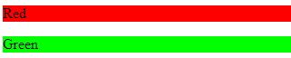
The background color is easily changeable with a simple selector tag and a few adjustments. Here is how the selector tags are done:
Selector Example¶#p1 {background-color:rgba(255,0,0,1);} #p2 {background-color:rgba(0,255,0,1);}Here is how the selector tags are applied to paragraph tags:
Applying Selectors¶<p id="p1">Red</p> <p id="p2">Green</p>
Once these tags are applied to the <p> tags above, the background of those words will appear red and green like this:
You can also change the colors using hexadecimal color codes, something like this:
Hexadecimal Color Code Changes¶#p3 {background-color: #FF0000;opacity:1;} <p id="p3">Red</p>This will do the same thing as above however using that special code. You can find these codes at this website, Hexadecimal Codes.
When it comes to resizing images and text on shrinking and growing screen sizes you can put responsive images and text in so it always looks proportional. The way to do it for an image is quite easy. All you have to do is add in the max-width style and it will not get bigger than its original size but will shrink to smaller screens as well!
Here is how you do it:
Responsive images and text¶/* This is a responsive Image */ <img src="picture.PNG" style="max-width:100%;height:auto;"> /* This is responsive Text */ <p style="font-size:10vw">Responsive Text!!!</p>
Media Queries
So, the first thing you need to do for a webpage would be add the <meta> tag in all your web pages. This allows the page, text, images and much more to shrink and grow appropriately with the page that you are looking at.
<meta name="viewport" content="width=device-width, initial-scale=1">
When it comes to Media Queries this is where format of the web page really comes into play. The media query is a rule that uses the identifier @media and only applies the CSS to a code block if a certain condition is true.
One quick example would be to make the background of the <b> (body) tag a different color using the @media selector. This is easy, all you have to do is set what you want to happen with a condition. So something like this:
@media only screen and (max-width: 600px) {
  body {
      background-color: blue;
  }
}
So in this example, if the screen was 600 pixels or smaller then the background of the body would change to blue from whatever it was before.
How to change the font size of your text based on screen size:
Change in font size¶@media only screen and (min-width: 601px){ div.whateverTextYouWantToChange { font-size: 80px; } } @media only screen and (max-width: 600px){ div.whateverTextYouWantToChange { font-size: 30px; } }
Another cool thing you can do is hide images. If the screen is too small to view them or you do not want a smaller device to render in a large picture, for example.
How to make an item disappear! (TA-DA)¶@media only screen and (max-width: 600px){ div.itemNotShown { display: none; } }
One thing that was mentioned on many of the sites I looked through, was you should always code for the smaller screens first. Scale up rather than down. So for example, instead of saying if the screen gets too small then change it. Make it so if it gets too big then change it. This way your website or app will load faster on the smaller screens.
The only thing that needs to be changed in the CSS when designing for mobile devices first is making it so instead of shrinking to size, we are growing. So, when making our columns for a page we will usually make it so each column takes up 100% of the width of the screen. This will allow cellphones to load faster and if the page gets larger than a certain size, then we change to columns taking up a certain percentage of the screen. For example.
/* This is for the cellphones, it makes the columns 100% width of the screen and the columns stack*/
[class*="col-"] {
      width: 100%;
}

/* Then if we hit 768px or greater we switch to columns taking up a percentage*/
/* of the screen and they are no longer stacking*/
@media only screen and (min-width: 768px) {
      /* this column will take up 25% of the screen, if assigned to a tag*/
      .col-1 {width: 25%;}
      /* this will take up 50% of the screen */
      .col-2 {width: 50%;}
}
Stylebot
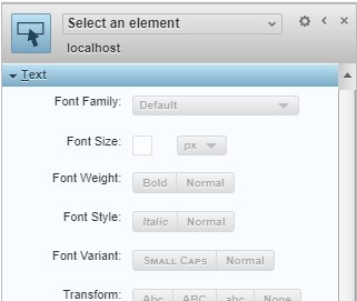
Style bot is an incredible tool for programmers to help understand and better their CSS code and writing ability. This tool works in sync with the Chrome web client and allows the user to change the CSS to the page on the fly. This will help the programmer or user to better understand what is going on, and give them a preview of what they changed almost instantly.
The way style bot works is you open it up and it will appear on the side of your Chrome client. In the side panel, where style bot is, you will see most of the selectors or things you can change on the website you are looking at.
Once you have chosen one of these options, you can choose what to do with it! There will be many options from font size, font style, font family, underline, letter spacing, color of the letters, background colors and much more. Here you can click what to apply and the CSS will automatically be shown on your instance of the website.
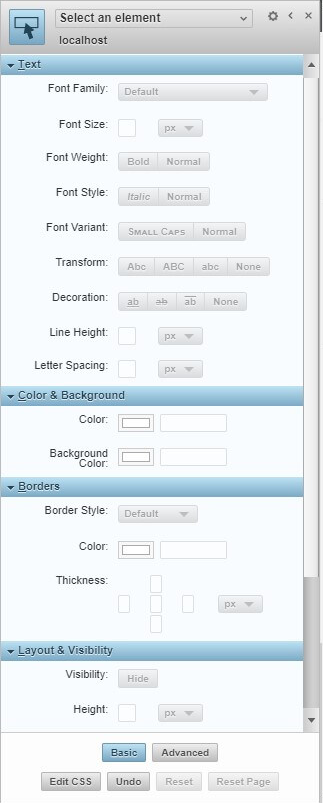
This is a great tool for changing your already built website’s CSS to see if any improvements can be made to the style or format. Also, it is useful for personal use. If you are colorblind for example you can change the colors on a website to make it more user-friendly for yourself. Once you are done with the CSS options you can see the CSS code you changed! [diviSpace]
Print CSS
When it comes to CSS and printing paper there are a few things to take into consideration. You want to be able to have both a screen or online CSS but also you want a printing CSS. This will allow the user to apply the correct style sheet when it comes to printing or displaying the page correctly. Here are a few questions you should ask about your website before making a print CSS:
- Is there clutter on the screen, when printing?
- Is there printing cost limitations involved?
- What is not needed on a printed piece of paper?
Like the pesky navigation menu that looks like this:
- Index
- Tab 1
- Tab 2
- Tab 3
This is how to get rid of it, just like the example above when not displaying images:
/* how to get rid of the nav*/
header nav {
      display: none;
}
Another unnecessary thing would be most all media options, like a video for example. Why would you need a video on a piece of paper? This is how you would take it out:
header nav, video, audio {
      display: none;
}
Another good idea would be making your images not as big or scale to the page so they do not go over the edge of the page. This can be done with the max/min-width tag like mentioned before, or you can set the images to a specific size.
img {
      max-width: 500px;
}

/* OR */

img {
      max-width: 100%;
}
Another thing you can do is change your fonts or size of fonts to your liking, depending on the different columns or text blocks.
/* This will change your first headers font size*/
h1 {
      font-size: 24pt; /* Change to any size you would like */
}

/* this will change your font for the body tag */
body {
      font: 12pt “Times New Roman”, serif;
}
All of these things in the end will make your website look better on print as well as save ink and paper. Whether that is the ability to change font size or make an image disappear either way there are many things you can do with CSS and printing but these were some of the basic things you can do with a print CSS. [SmashingMagazine]
Conclusion
Overall, when it comes to CSS on your website or mobile app all of these tools above can be extremely helpful. For formatting, styling, and perfecting a website or app CSS is needed and most likely will stay that way for awhile, until something better comes out. More tools will come out to make CSS easier to implement like Style bot but the core of CSS will remain. CSS is embedded into pretty much every website you can think of when it comes to online and without it everything would look bland, boring and just not appealing.
Sources
| [w3SchoolsRef] | “HTML Responsive Web Design” w3Schools. w3Schools.com, 4/4/2019. |
| [diviSpace] | John Anderson. “How to use Stylebot:” divi.space, Web. 18 Dec. 2017. |
| [MediaQueries] | “Media Queries” w3Schools. w3Schools.com, 4/16/2019. |
| [SmashingMagazine] | Christian Krammer. “How To Setup A Print Style Sheet” SmashingMagazine. smashingmagazine.com, 4/16/2019. |
| [CSSHistory] | Bert Bos. “History on CSS” Style Activity Lead, Web. 17 Dec. 2016. |
| [w3SchoolsMediaQueries] | “More on Media Queries” w3Schools. w3Schools.com, 4/17/2019. |